
 I rewatched “The Silence of the Lambs“, the 1991 film by Jonathan Demme. I think it is his best film, though I am sure at the time we probably felt than his next, Philadelphia, was more important.
I don’t think I’ve seen “The Silence of the Lambs” for a very long time but I am happy to say that it is still a great movie. And anyone that has been paying attention to other things that have happened in the past decade will find disturbing parallels to a current trend. But this is not about that.
This is about kerning. Kerning is the adjusting the spacing between characters in a text to make it easier to read and understand.
I don’t recall experiencing this back when I saw in the theater originally but this time I did. In between, I spent 13 years working in a graphical design company and working with talented designers, some sensibilities rub off.
So, when I started the movie I shortly thought “Really? Couldn’t they get someone to do proper kerning for the titles?”
Turns out, the improper kerning was intentional:
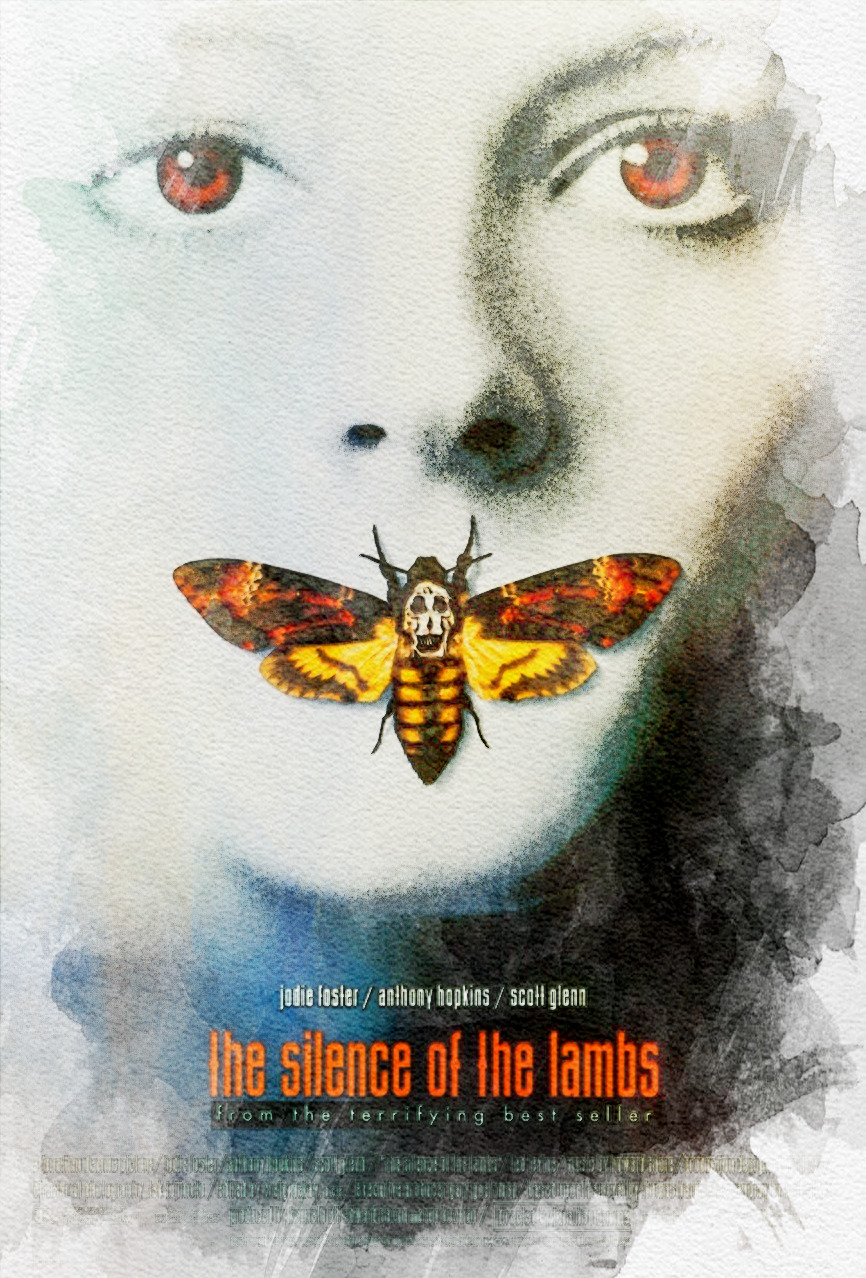
While Starling makes her way through the woods and through the halls of FBI headquarters, large black credits block out portions of the image. Created by designer Tibor Kalman’s studio M & Co., the credits feature subtly inconsistent kerning and placement. The heavy jet-black letters and thick white border lend the sequence a distinct gravity, pulling attention from the action of the scene with a formal unease.
— Art of the Title, “The Silence of the Lambs (1991)“
Maybe it worked better before I learned to spot improper kerning. I certainly remember the movie having a huge impact on me.
